Airplane Scene
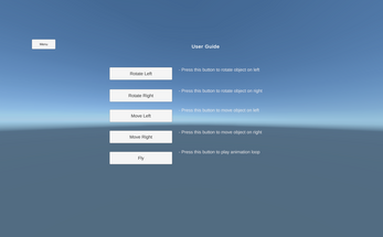
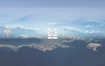
Based on the principle of User Experience and User Design. The Greybox prototyping of the Menu and Airplane scene is created. Following the consistent theme and color matching pattern menu is designed with its necessary components like heading and buttons are created. Throughout the application, a blue color combination with black ariel text of font size 16 is used. In order to make an interactive design, there are multiple options in the play scene where the user can move the object and play the animation. Buttons are evenly spaced creating clean layout which appeals users.
| Status | In development |
| Platforms | HTML5 |
| Author | sagar123 |
| Genre | Educational |
| Made with | Unity |


Comments
Log in with itch.io to leave a comment.
Likes:
Dislikes
Feedback on menu
Likes:
Suggestions: